BRIDGING INSOMNIA COOKIES BRAND WITH THEIR ONLINE ORDERING EXPERIENCE
GO-TO MARKET / UX DESIGN
PROJECT DETAILS
Insomina Cookies / UX Designer @ Siberia / Client Project / 4 Designers Total / 2 Months / Year 2020
PROJECT ASK
Develop a Go-To Market delivery platform using visual direction guidelines & set ux feature requirements
ROLES AND RESPONSIBILITES
Leading reviews, delivering ux designs, delivering prototypes, supporting with QA, collaborating endlessly with our product, engineering partners and presenting to client. Teamed with Design Director, Visual Designer, llustrator
01 / OVERVIEW
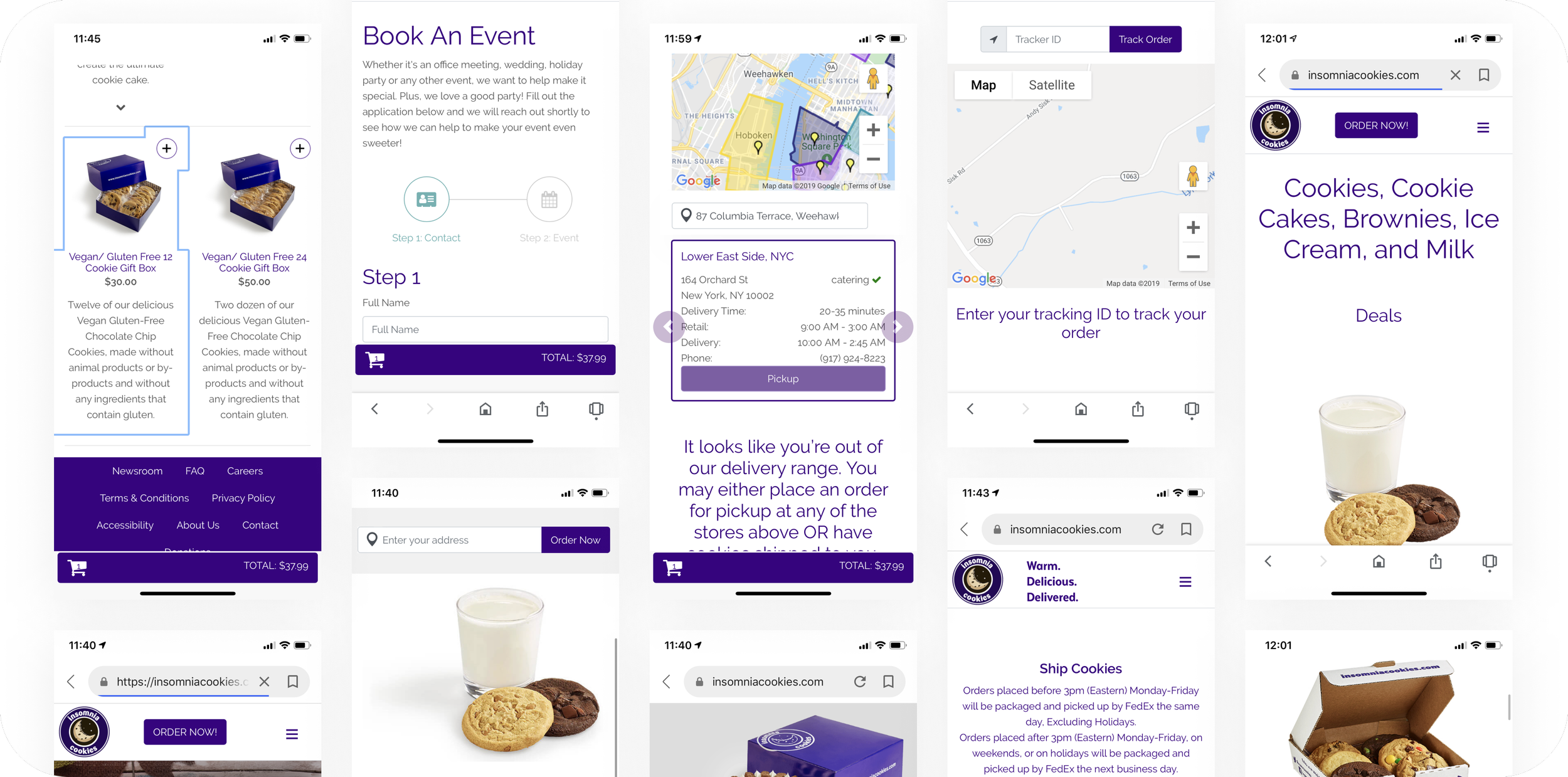
Insomnia’s products drove brand love within their community, but didn’t translate well once delivery and online ordering became the primary experience for majority of their customers.
PROBLEM
Disconnected brand experience
Their online presence didn’t display insomnia’s brand, brand values or give the same customer experience most customers felt in their brick & mortar locations.
Minimal communication
Majority of their support calls revolved around delivery orders about status. Customers were always left in the “unknown” of when their order would arrive.
Reaching a wider insomniac community
Insomnia Cookies began to attract new customers outside of their core college demographic, which brought the opportunity to expand to a larger market. To do so, they needed to take a step back and re-evaluate their brand & current digital delivery system to ensure that they were ready to welcome, share and support a wider community.
02 / UX DESIGN
CHALLENGE
How could we translate Insomnia’s quirky & fun brand into their online ordering experience, while keeping customers excited and informed of every order.
APPROACH
Every order starts with a craving
Learning through their audience, almost every order started with a craving or a need for a specific flavor or texture. We asked ourselves, how could the landing experience quickly identify those cravings and lead them to ordering.
DESIGN DECISIONS
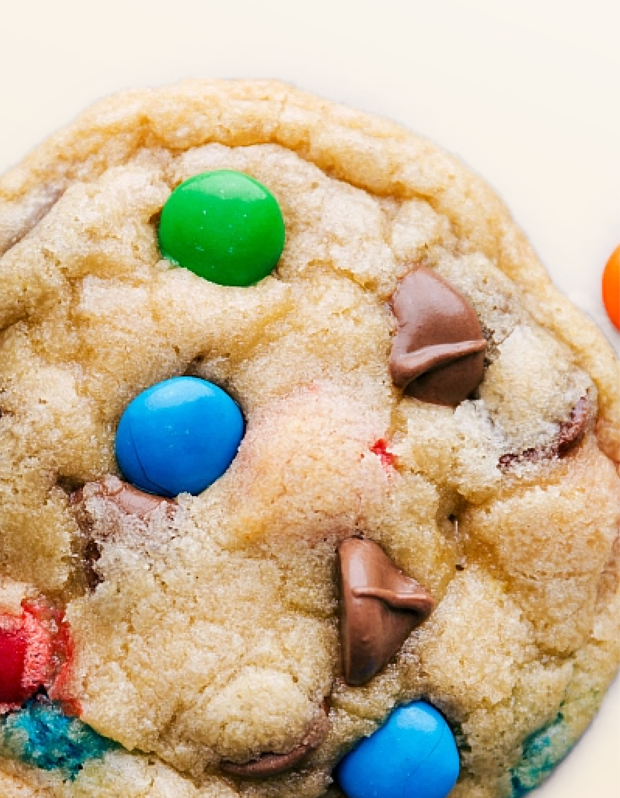
Cookie shots and sensory images
We thought about the feelings you get when you eat a warm insomnia cookie and what that sensory expression looked like. Towards the end of our exploration, we had a mouth watering moodboard to help lead our landing experience focusing on the cookies & the gooeyness more than anything else.
Simpler vs branded templates
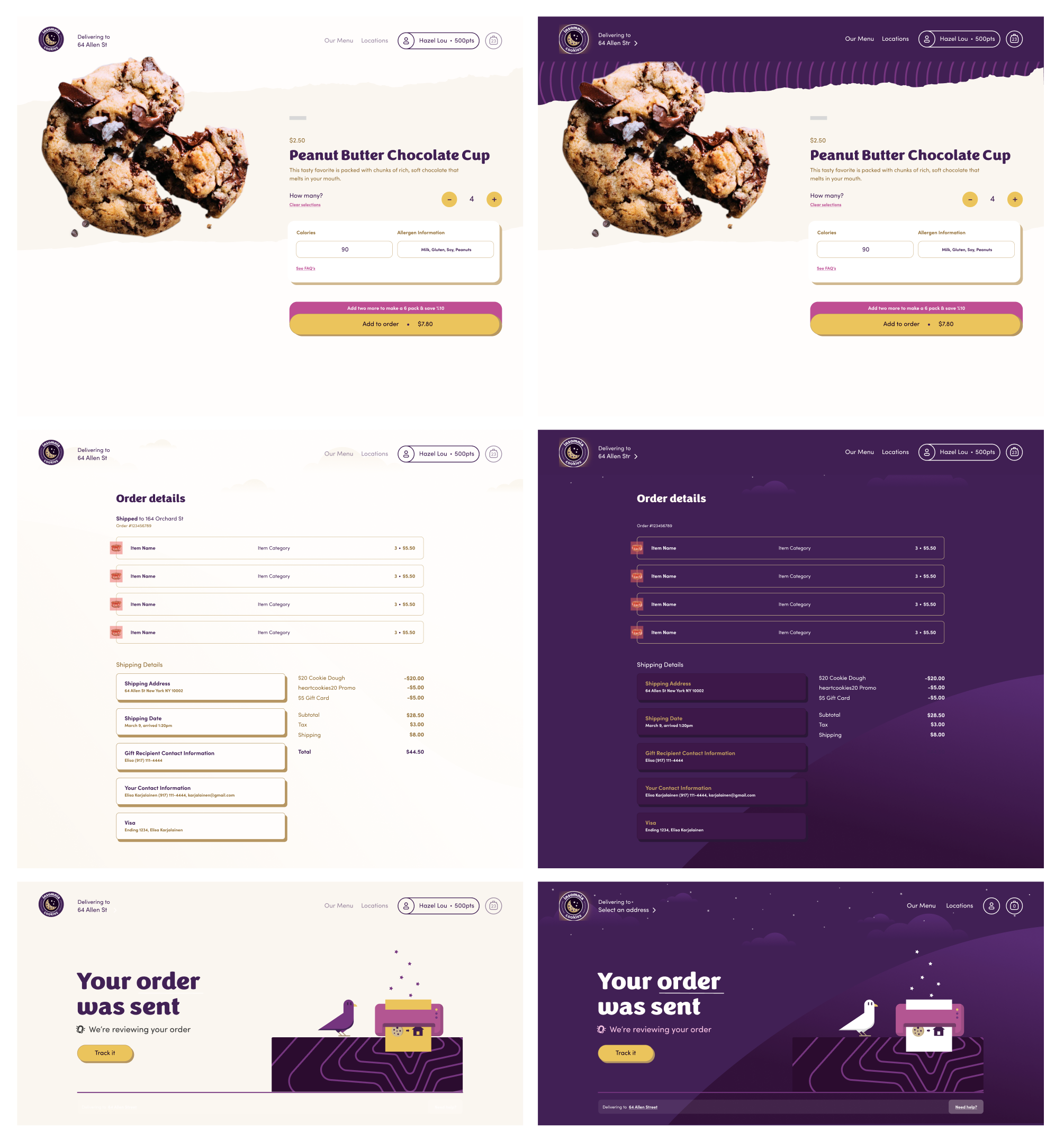
Kept our designs beige and simple for more complex decision making, and then purple, quirky and moody for key moments.
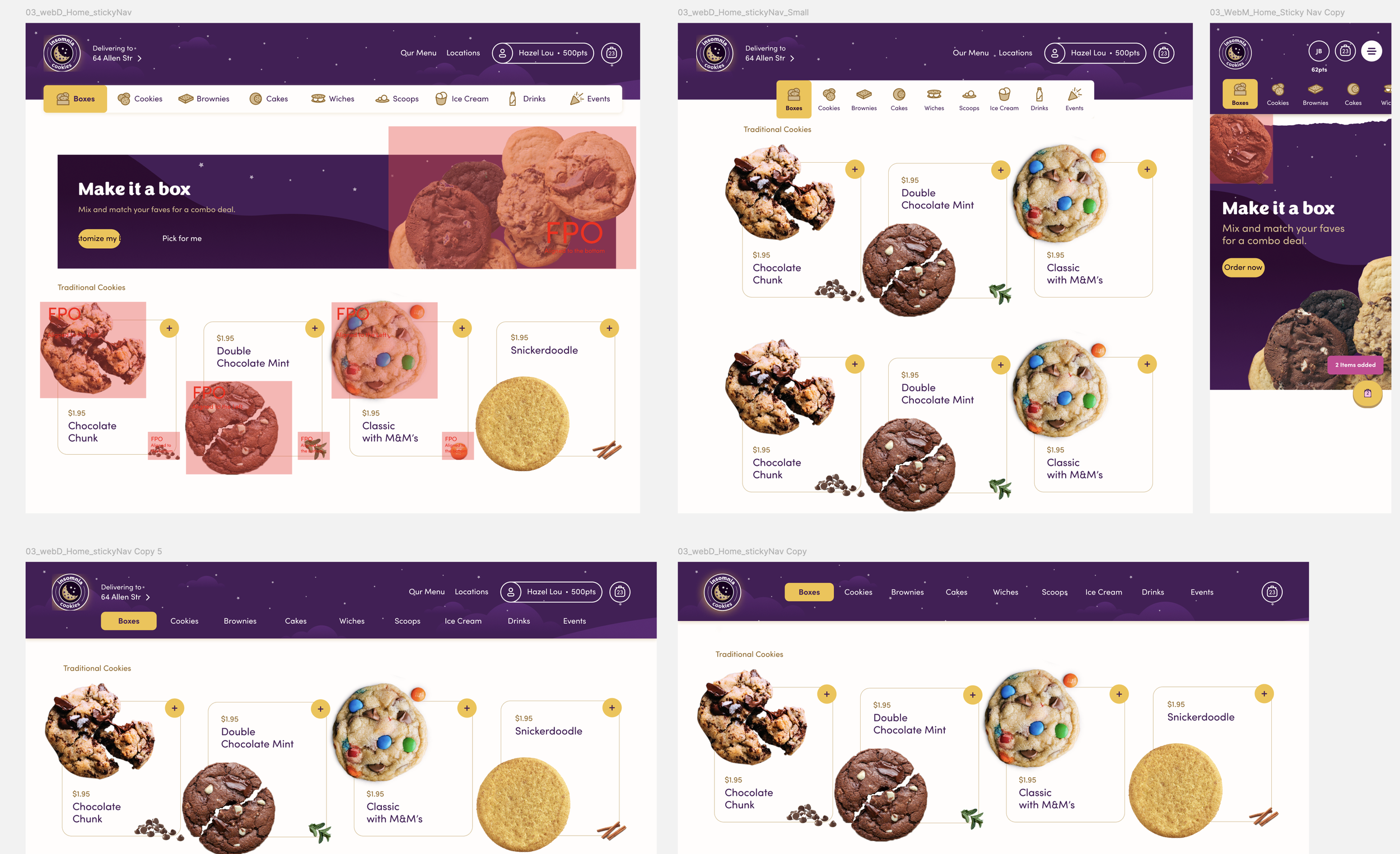
Stickey browsing filters
Stayed put with the floating filters with the white as it felt more noticeable and upfront
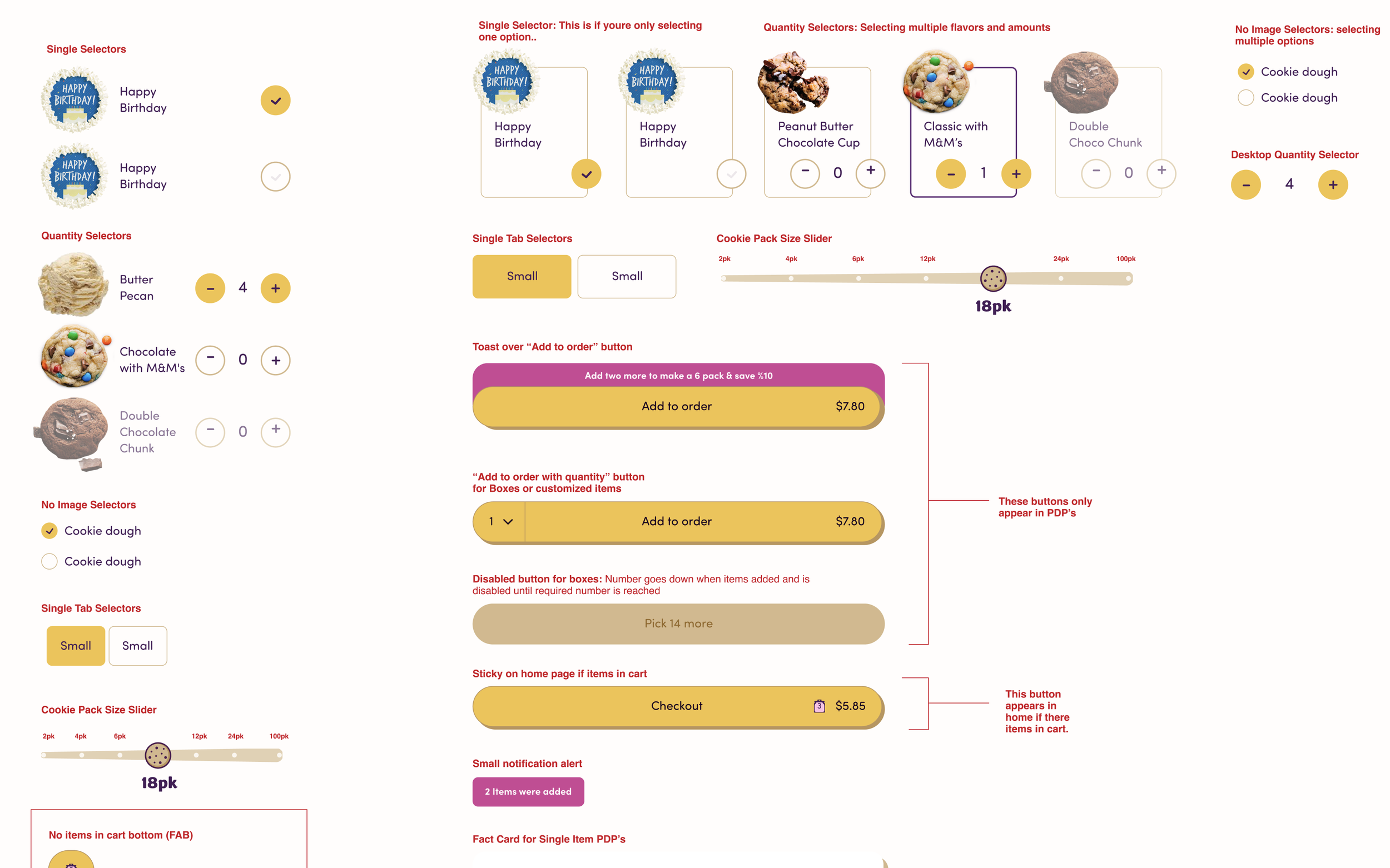
Expanded the DSL aligning with the visual direction to use across sprints
03 / OUTPUTS
Experience focused on the cookies & the gooeyness
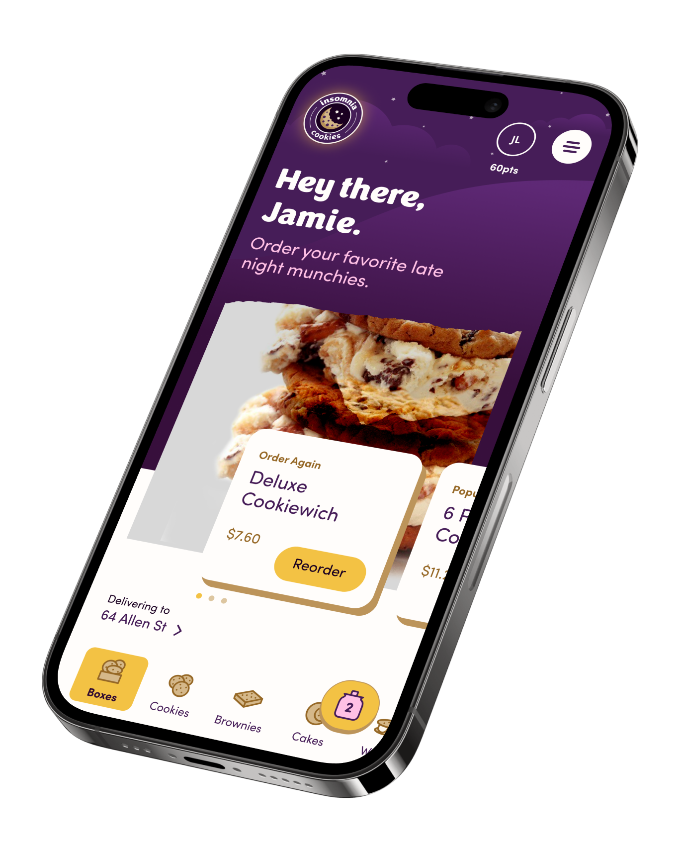
Easily order your fav’s
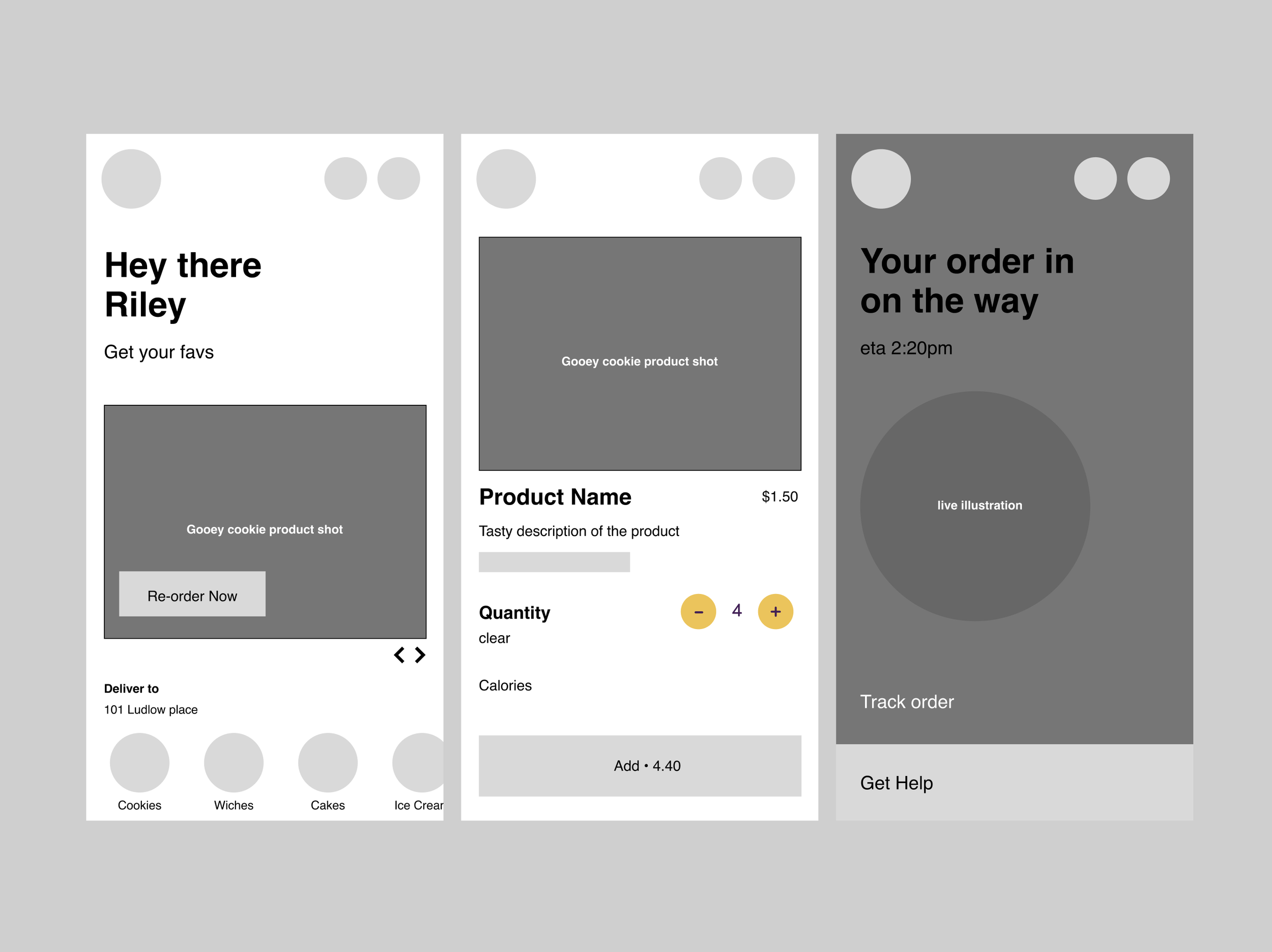
Cravings change sometimes, but they typically stayed within the same 2-3 orders. Every time you came back, we made sure to surface your favorites at the top.
Always starting with home
Not every location had the same menu—nor could we deliver to every home. We made sure to set the experience based on where you lived while having the ability to switch your location.
Gifts for your loved ones
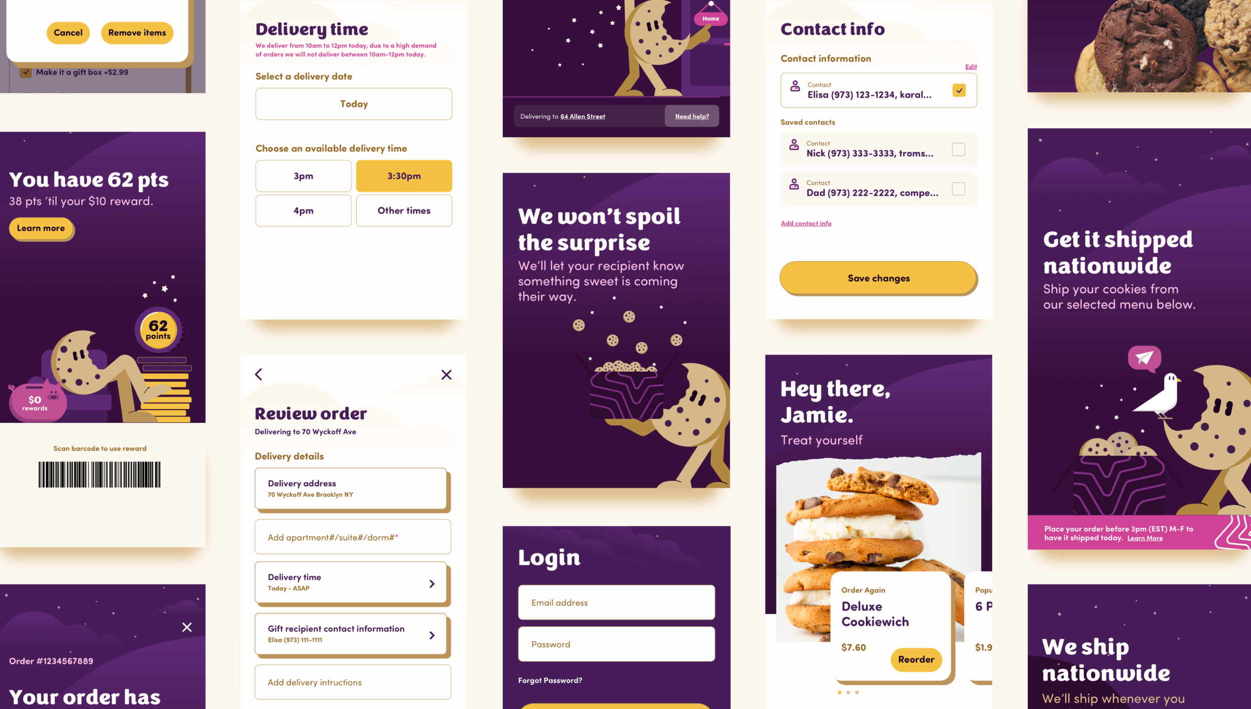
Gifting was a popular use case, and so we made it extremely easy to checkout secret gifts and kept you & your loved one in the loop until your gift arrived safe and sound.
Made it a celebration
The brand flourished around satisfying midnight cravings, meaning they needed to work fast. Although we couldn’t control how fast your delivery folk would deliver your order, we could help through assurance, transparency, excitement, and celebration.
We felt this moment of anticipation would be a great opportunity to incorporate the brands tone of voice and personality. The obvious was ensuring we imbedded live & realistic time estimates but from a design challenge it was key to deliver excitement through every key moment.
Cookies on us
Orders were also being simultaneously fulfilled through 3rd party platforms, but to help incentivize in house orders, we kickstarted a preliminary loyalty program where every dollar was a point and once an insomniac reached 100 points they could redeem a $10 voucher code. If this helped keep orders in house, product teams could later expand the program knowing they were increasing business margins.
"Crave. Serve. Celebrate. Transforming delivery into a fun and satisfying experience for our insomniacs.”
These were the first steps for Insomnia Cookies to bridge their brand into their digital ecosystem, ready scale and invite a wider audience of insomniacs.
The Scrapbook
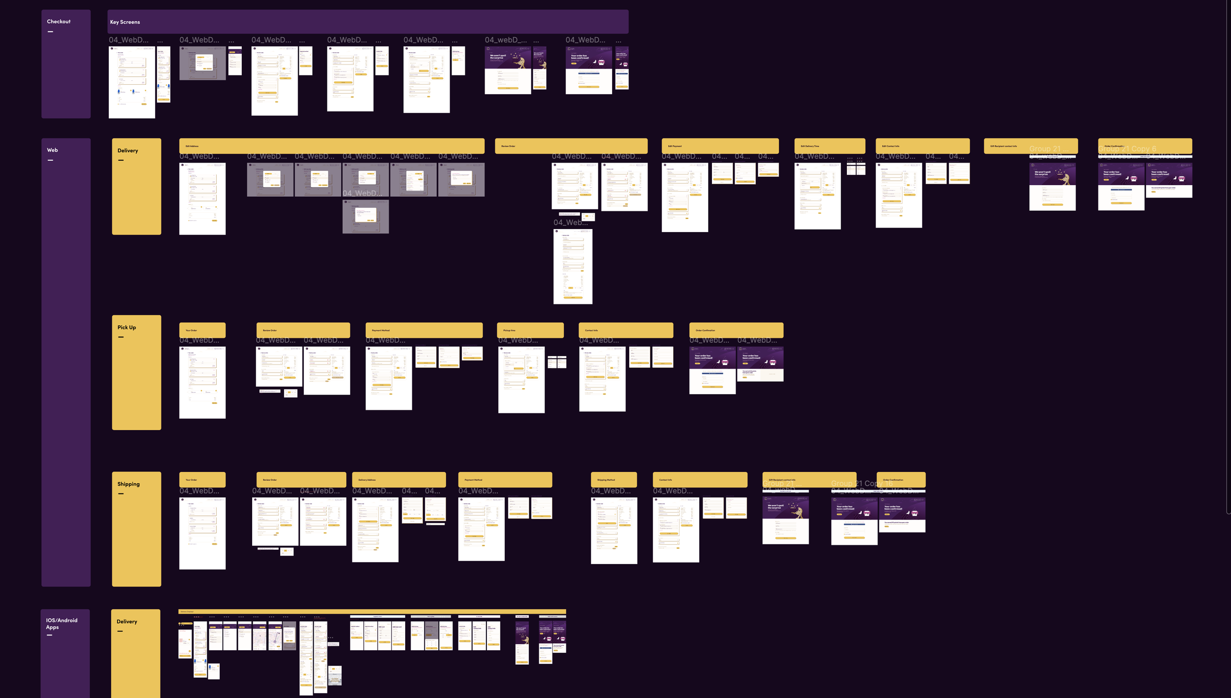
There’s always more to show. Attached are a few artifacts that I used throughout this project.
Key Deliverables: Key Flows & Prototypes for Responsive Web & Native Apps, UX Specs & Handoff Files, Design QA, Sprint Plannings, Feature Requirements, Production Wireframes & iterations, UI Library organized for sprint dev.
